
This guide focuses on “Muse build website” and turns the question into practical steps you can check.
01 | What this example actually teaches
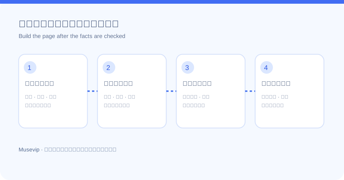
X user @Chris62771610 recorded a Muse workflow that gathered public information about Hong Kong credit card welcome offers and turned it into a filterable comparison page. The useful pattern is not a magic one-line prompt. It is the sequence: define the comparison, check the facts, build the interface, then inspect what visitors can actually open.
This is one person's demonstration. Offer values, eligibility rules, and any hosting option shown in the recording may differ now or on your account. Treat the video as a workflow example and verify every live detail yourself.
02 | Step 1: Make the scope small enough to verify
Instead of asking for a general credit card site, specify the region, products, official sources, and comparison fields. For this case, useful fields include bank, card, welcome reward, spending threshold, deadline, annual fee, eligibility, currency, and the bank's own terms page.
Decide how readers will filter: by reward type, required spending, annual fee, or end date. If the official page is unclear, display 'needs verification' rather than filling in a plausible number.
03 | Step 2: Ask for a source table before design
Have Muse produce a table of each offer, its official bank page, and the date checked. Sample at least three high-risk fields: expiry date, actual spending requirement, and conditions for receiving the reward. Marketing headlines often omit customer or channel restrictions.
If an offer is supported only by a social screenshot or forum comment, keep it out of the published ranking until you can find official terms. A shorter page with traceable entries is more useful than a full page of uncertain claims.
04 | Step 3: Turn reviewed data into an Artifact
Once the table is sound, ask Muse to build a readable page with a visible update date, mobile-friendly filters, offer conditions, and source links. Meta says Muse can produce web pages and other rich Artifacts. The exact save, share, or publishing controls available to you depend on your current account and interface.
Try the filters at a phone-sized width, open several source links, and check how an expiring offer appears. A polished preview is only the start of review.
05 | Step 4: Inspect the public result
- Open the final URL as a signed-out visitor. An in-chat preview is not proof of publication.
- Verify currencies, dates, eligibility, and links against the banks' current pages.
- Make sure the public page does not expose private chat content, editing access, or draft data.
- Read the visibility and update controls before publishing or attaching a domain.
- Plan how you will remove expired offers and correct changed terms.
06 | A prompt you can adapt
Replace the brackets with your own subject. Keep the first pass to research and preview; publish only after review.
- Create a comparison page for [topic] aimed at [audience]. Use only these official sources: [links]. Mark missing fields as 'needs verification'.
- First deliver a table with name, conditions, fees, expiry, source URL, date checked, and open questions. Wait for my review before building the page.
- Then make a mobile-readable page with filters, an update date, and a source for each entry. Do not invent rankings or missing terms.
- Give me a preview and a list of three things to verify. Do not publish, connect a domain, or submit an application without my confirmation.
07 | Use the pattern beyond credit cards
The same sequence works for phone plans, event calendars, software pricing, or course lists. The page may look impressive quickly; the source table and update process are what make it useful later.
References
These sources support the product information in this guide. Musevip is an independent publication and is not affiliated with Meta.
Last reviewed 2026.09.28. Product pages may change.